
Wednesday, 25 January 2012
Tuesday, 24 January 2012


Friday, 13 January 2012

Double Page Spread Photoshoot Plan
Double Page Spread Photoshoot Plan
Item/Model | Shot type/angle/ distance | Macro, Flash and Lighting | Background | Positioning on front cover/TOC | Details of editing |
Holly Glavin | Medium shot- maybe a close up. | Inside flash maybe need. The photos will be taken in a brightly lit room. | Plain white background. Against a white wall. | Will be positioned only on my double page spread page. | Enhance brightness contrast. Edit out flaws. |
Friday, 6 January 2012


Thursday, 5 January 2012
Front Cover Photoshoot Plan
Front Cover Photoshoot Plan
Item/Model | Shot type/angle/ distance | Macro, Flash and Lighting | Background | Positioning on front cover/TOC | Details of editing |
Holly Glavin | All types – more is better, Like the ID magazine, more than just one photo on the cover. | Outside, natural light- not flash needed- unless in a shadow. | In forest/woods. Lots of trees in the background- with Christmas ball balls hanging from them. This creates a successful foreground, middle ground and background. | Mainly for the cover and a shot for the table of contents. | Enhance brightness contrast. Edit out flaws – twigs and leaves that may accidentally be in the picture. |
Inspiration
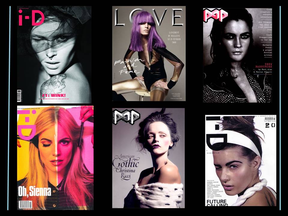
Before I began my own music magazine, I looked at the music magazine Clash for inspiration and to gain some insight in to the layout and format of a magazine. The cover of Clash I chose to study is plain and simple, only containing a masthead and the word 'heavenly' and unlike most magazines this cover of Clash does not have any by-lines, coverlines, explanatory text (though Heavenly could be a suggestion of a theme) or any kickers. In response to this I would like to take a similar approach to my own music magazine cover. Not because I wish to make the work easier but because I believe this particular 'look' applies to a new genre of magazine which is uber stylish and targets a selective hip audience). Below are a selection of images I have collected of magazines that adhere to this particular style. ID, Love and Pop magazine hardly ever crowd their magazine covers with coverline, explanatory text etc.

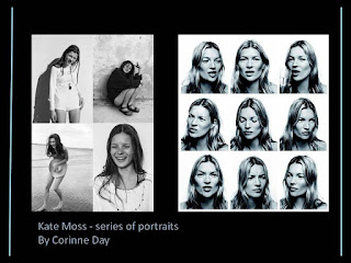
I do not want my cover to be so minamalistic that it becomes boring, therefore to show I have put thought and effort into it I want my cover image to be a series of photos rather than just one. I think this is effective as it creates a different yet interesting look breaking away from all the typical headshot photos and the audience have more to look at drawing them closer. I'm inspired by top fashion photographer Corinne Day work as she has done a series of photographic portraits of Kate Moss. Below is a selection of images which have influenced my idea.

I do not want my cover to be so minamalistic that it becomes boring, therefore to show I have put thought and effort into it I want my cover image to be a series of photos rather than just one. I think this is effective as it creates a different yet interesting look breaking away from all the typical headshot photos and the audience have more to look at drawing them closer. I'm inspired by top fashion photographer Corinne Day work as she has done a series of photographic portraits of Kate Moss. Below is a selection of images which have influenced my idea.


Subscribe to:
Comments (Atom)